Your Trusted Real Estate Advisors. Let Us Help You!
Chic in Chicago
A Francophile-Inspired Primary Suite Offers Joie de Vivre
When Chicago, Illinois-designer Amber Golob first walked into the Lincoln Park manse that was chosen to host a recent designer showhouse, she was blown away by its backstory. The 1917 Georgian-inspired grande dame was originally designed by then-starchitect David Adler for Titanic survivor Emily Ryerson, whose husband and the father of her children—steel baron Arthur Ryerson—went down with the ship. “When I walked in the room and toured the property, I was really moved by the history of it,” Golob recalls of the home, perched on Chicagoland’s illustrious Gold Coast. Ryerson’s home was one in a series of six row houses originally designed for artists and society friends.
For the Adler on the Park Showhouse 2022, Golob designed the primary bedroom, which reminded her of a Gilded-Age French retreat thanks to its molding, trim work, and myriad windows. “In Chicago, having a room with windows on three sides is amazing,” she says. “It felt light-filled, like I was stepping into a Parisian apartment at the turn of the century.”
As a designer showhouse that would benefit local charities—including the Big Shoulders Fund, which helps fund area schools, and Thresholds, a nonprofit focused on improving the lives of people with mental illness—this project didn’t have a real client. Translation? Golob could have carte blanche over every design decision without anyone else weighing in with their own decorating opinions. “A lot of my clients in Chicago have more modern or contemporary taste, so I was super excited to do more heavy antiquing and use older items and richer colors—that’s what inspired me,” she says. When she first got her hands on the space, “it was just white . . . it had been completely rehabbed but empty.”
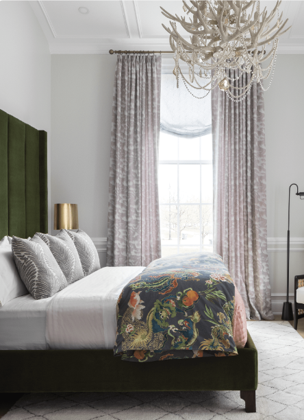
She quickly set about furnishing it, adding patina with wallcoverings and swapping out light fixtures to show-stopping effect. Golob emphasized the towering ceilings with a tall channel tufted headboard; hung draperies just under the crown molding; and installed an antler chandelier cheekily swathed in dangling beads. The en-suite bathroom is a jewelbox of gleaming black paint, with fanciful floral paintings and sumptuous roman shades. And the walk-in closet would be any Gilded Age tycoon’s dream dressing space. “I always wanted to do the windows at Macy’s or something, so I had a lot of fun staging the closets in an artistic way,” she says.
One key to the storied look: sourcing a smattering of vintage and antique finds that would conjure the era. “I traveled across the Midwest [to shop] small towns like Elizabeth, Illinois, where they have a huge antique mall in an old school,” says Golob. “I felt like I was stepping back in time.” Among their bounty? Old spectacles and beautifying accessories like a perfume diffuser and an upholstery brush set. “It did make it feel like the original owners of the house were using this room,” she says. To keep the space feeling fresh, she juxtaposed those classical elements with modern ones, including streamlined furniture and butterflies that appear to flit across the wall. “I wanted it to be a little edgy—not too soft,” she says.
One of Golob’s top tips for a primary suite is to ensure you have a seating area, however small, to help the room feel fully outfitted and luxe. Here, she installed a velvet chaise and rattan accent chair. “Think about what you can bring in instead of the usual end-of-bed bench that can make the room feel more special,” she says. “Create a place you can really sit and scroll your phone, read a book, and talk to your spouse. Unexpected seating helps a lot!”
Another thing to keep in mind in this corner of the home is a focus on restfulness, given the room’s true raison d’être (reason for being), as they put it in French. “Find your focal point in your room: is it your light fixture? Your bed and bedding?” says Golob. In this space, she chose a subtle drapery color and grounding black bedside tables to let the room’s more vibrant elements take center stage. “Remember, not everything can be the belle of the ball.”
Written by Kathryn O'Shea-Evens / Photography by Ryan Hainey
Home By Design
